10 Kick-ass Tips for Infographics Marketing for 2025

In the digital world, technology abound. However, users like stories. For anyone who wants to tell a relevant story with dynamics visualization, infographics and long scroll graphics are the perfect tools. Infographics help your brand achieve better search engine exposure. This in turn helps you reach a targeted audience. When your target audience “connects” with your story, they see you as a trustworthy source of relevant.
Before you start creating your next infographic, go through all the infographics tips we have painstakingly compiled below to capture the attention of a targeted audience and increase the number of readers for your infographics.
Kick-ass Tips for Infographics Marketing
Compelling Title & Headings
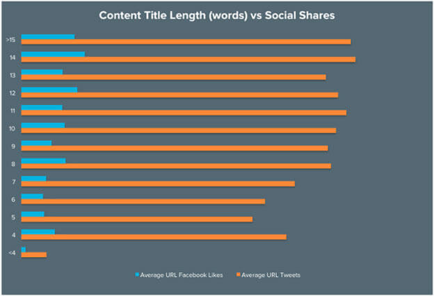
Want your content to go viral? Research, research, research, and read a ton about creating magnetic headlines. A bold and catchy headline will grab the reader’s attention. If your readers aren’t attracted to your title, forget about them noticing the visual representation and eye-popping graphics. Try explaining what your content is all about, KISS (Keep it simple, Sally).

Image Source: Hubspot
Storytelling and Meaningfulness
Infographics are all about telling a story rather than just creating a horde of text and design. Once you decide the topic, start your research and collect as much data as you can. Think in terms of “folds” just like you will think for a home page of your website. A creative infographic has “parts” that are interconnected. Each part of your infographic is like a chapter of the storybook. Separate the parts by design elements but connect them with meaningfulness.
Never go Random, Select an Interesting & Popular Topic
No matter how much data you capture and present, it is of no use if readers don’t find it useful for them.
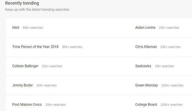
Watch out for latest’s happenings and hot news around the world. To find some interesting data about the latest trends, use Google Trends.
The story which connects personally with the readers creates stronger emotional responses. Be careful, not to choose any sensitive topic which may show you in bad light leading to wrong publicity. If the data presented doesn’t hurt any emotions and clearly states the right purpose, which is educating a person, it will do a great job without hurting any sentiments.
The power of an infographic is to build awareness and build a trustworthy relationship between the promoter and the reader.
Infographic Types and Layout
You have collected impressive data and are ready to incorporate it in your infographic. However, you have to now deal with the biggest part – presentation. The problem is there are a lot of infographic styles, and you need to figure out which works best for your data.
There are several types that you may consider. However, we suggest sticking with followings as these are the most popular ones and readers are used to seeing them.
- Informational infographics
- Comparison infographics
- Timeline infographics
- Statistical infographics
- List infographics
- Hierarchical infographics
- Anatomical infographics
- Demographics or location-based infographics
- How to infographics
For content marketers, infographics marketing is going to be tougher than ever. Put your ideas and strategies together in a creative way and make them unique to make your infographic stand out among the competition.
First, determine the type of data you want to convey and select the layout from one column, two columns or three columns. For example, if you want to display a mobile phone comparison, choose a two-column layout.
Make it Mobile
Now, most of us don’t realize even after knowing the fact that more than 50% users around the world search using their mobile phone. So, the question is, does your great storytelling infographic should be made keeping mobile users in mind? And no prizes for guessing the right answer which is a resounding Yes.
It again boils down to the type of data and the target audience. For example, a reader who wants to make a quick brand comparison would probably run a search query and if your comparison infographic is bold, clear and visible even in the small screen could be the real problem solver.
Take a mobile-first approach and produce infographics with readable text, eye-catchy typography and compressed images that load fast on mobile devices.
Symmetrical and Asymmetrical Balance
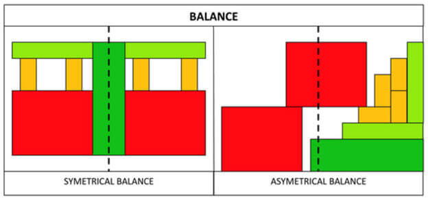
For a balanced composition, learn and follow design principles. Text and design elements should go hand in hand. For example, content with equal weight, such as, in comparison infographics or list infographics should go with a symmetrical design. To give a dynamic and natural look, asymmetrical would be perfect such as in timeline or informational infographics.
Don’t take everything go so easy, understand the fact the visual mindset is necessary to craft a beautiful infographic that everybody loves.
Image Source: The Quilt Show
Innovative Design Elements
To make your infographic more attractive, add bar graphs, pie charts, diagrams, and other data visualization. These elements convey that data is very well researched and they help capture a reader’s attention.
Rich and Informative Content
To create the most informative and relevant infographic, you need to dive deeper into the topic to completely understand it. Adding a few charts and graphs would do the job, but it won’t do any good if the readers find this somewhere else.
A considerable amount of time and effort is required to produce a remarkable infographic. A design-centric approach and the understanding of topic would make it lot easier to be on the track of relevancy and information. Moreover, don’t forget to put citations to sources that you’ve used to collect data.
Workaround Centralized Theme and Color
The right choice of colors will make your infographic look real and will appeal to the eyes and minds of your viewers. Centralize the whole idea, and it becomes necessary to choose a theme and play around to set the perfect balance of contrast for great text visibility.
Make sure to fill your infographics with a limited set of colors, which will make it look more professional and classy.
Optimize and Share on Various Channels
We’re sure you want to reach a large number of audiences, so share as much as you can on various social media platforms, blogs, and other channels.
However! Before you do that, please optimize your infographic for sharing on a different channel as per their design standard for best possible legibility and compatibility.
Another thing to keep in mind is that create various versions of your infographic with a few design changes if required for email, press release or if you want to incorporate it in white papers or eBooks.
CONCLUSION
Always remember you are creating infographics for your audience.
Get the best team of professional designers to research, strategize, prepare content and create visually appealing infographics with effective infographics marketing strategy. Cibirix understands your needs and produces highly engaging infographics focusing on audience-specific needs.
Grow your business online; contact us now at sales@cibirix.com for professional infographic design and services.
About Author

Ashish Roy
Since founding Cibirix, Ashish has leveraged his marketing degree to lead the agency in crafting meaningful digital marketing experiences for clients. His results-driven approach is a unique mix of analytical thinking, crisp visual aesthetics and a desire to simplify frontends while developing robust architecture. With a passion for design, technology, & marketing, He leads each aspect of the agency’s business and oversees its talented team of digital professionals.


